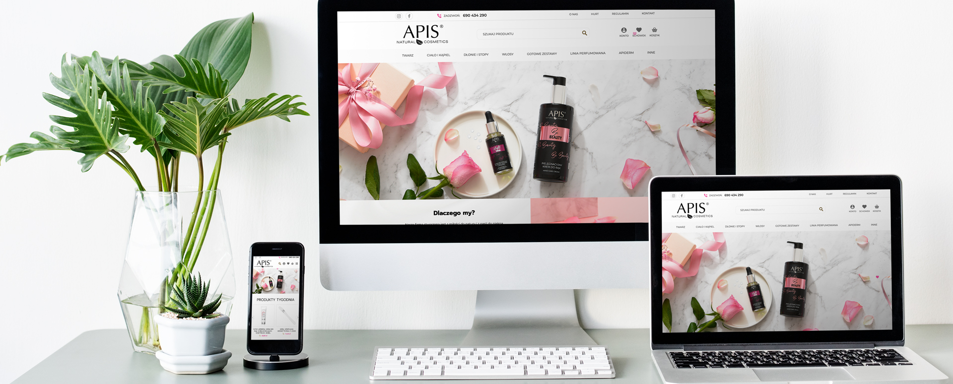
Every interactive agency specializing in creating and positioning websites has practically unlimited possibilities of communication. This is not only the information layer, nor does it end with the content of photos and graphics. The communication potential of a website is the mood resulting from the totality of impressions it provides. It is true - no one is able to predict with 100% certainty the reactions of users, or determine what exactly encourages a potential Client to use the offer placed on the website. However, when designing a website, you can rely on unchanging mechanisms of perception and in this way make the message of the website something more than just the sum of the information collected on it. A good example of such a strategy is the website of the Apis company.
We often tell our Clients that the only limitation is their imagination and that a website must be the most faithful projection of a given business and its assumptions. In many cases, it is enough to refine a few details so that a potential Client intuitively knows that the website they have landed on is exactly what they want. Information in the descriptive layer, such as that Apis is a family manufacturing company and belongs to the professional cosmetics industry, is just one aspect of the impact of a website on the average user's attention. The rest is completed by the impression, which consists of the appropriate composition of the visual layer, starting with such a small thing as a heart accompanying the mouse cursor after entering the website. Another technique that builds the impression of relevance is the color scheme. The standard black font may seem out of place to a layman, after all, online cosmetics stores and perfumeries regularly use a blaze of colors - here, however, this technique is deliberate, because in the case of lesser-known brands, overloading with colors is understood as a means of distraction, so the user may start to worry before they get to know the offer. The second issue - pictograms and icons are pink and burgundy. Both colors belong to the same range, which the subconscious perceives as an encouragement to focus (as opposed to "scattered" colors, e.g. green and purple) and are additionally tied together by subtle beige, associated with the colors of cosmetic products and their packaging. In this way, a user visiting the Apis website can intuitively understand its character without even reading its description. Of course, these are not all the treatments on the website, nor all the methods our agency uses in designing websites.


