


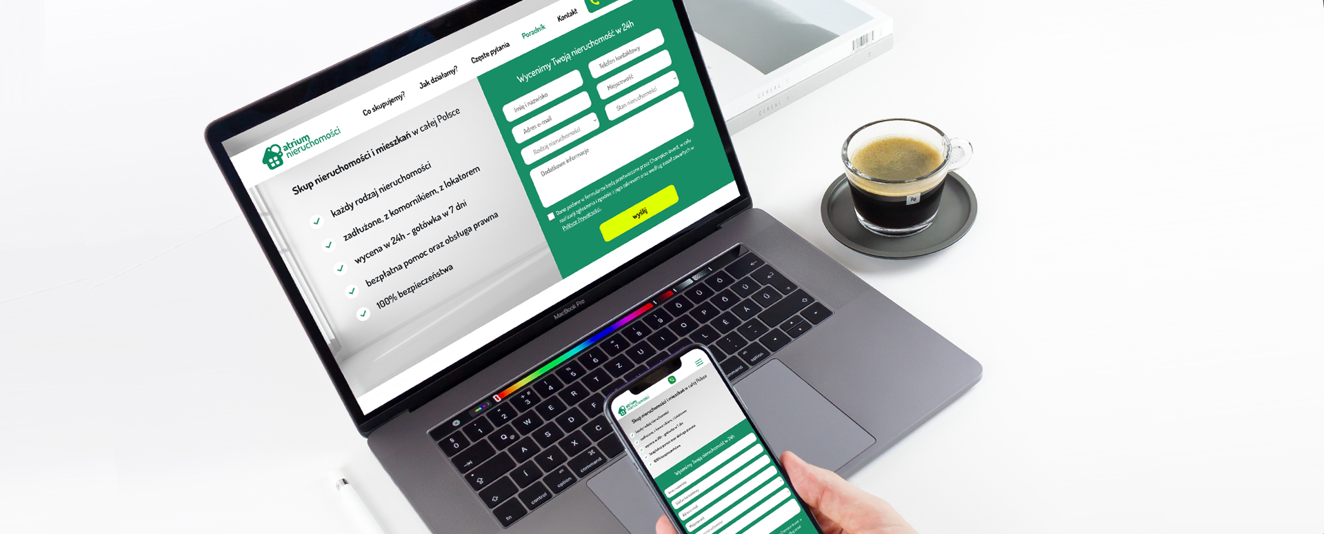
Sometimes it happens that Clients who start cooperation with our agency believe that it is enough to have the company logo and a detailed description of its activity on the website. Without photos, without special text architecture, and sometimes even without bullet points in individual sections. However, if the website is to be legible, and therefore user-friendly, it is worth applying one golden rule. What is it? If the home page of a website, or any of the subpages, is to be longer than 1.5 screens, it cannot be so-called "sheet metal". Small businesses that require an online business card with one main page the size of the screen and two usually smaller subpages, such as the distribution of wooden pallets or a wood warehouse, can afford it, and are usually created without the need to cooperate with an IT agency. However, an extensive activity conducted in several different aspects of one field needs something more, i.e. an appropriate composition, an appropriate visual layer and specialist content architecture - including internal linking. A good example of the management of information about the company's activity is the Atrium-nieruchomości website created by us.
Real estate trading is a popular investment sector, which is why designing a website for a company conducting such activity is always a two-track process. The website must be different from the websites of competitors, but at the same time meet the marketing requirements specific to the industry. And now just look at the size of the text layer. If you "stuff" the content into the volume it takes up without dividing it into sections and giving up graphic treatments, few people would want to read it. In addition to the fact that the attention and concentration of a potential user are always limited in time and dependent on factors that we have no influence on, the human eye gets tired when dealing with a uniform block of text. Meanwhile, the owner of the website wants the potential customer to be reliably informed and have at least a basic orientation in the company's activities before they decide to use the offer or establish contact.
So when composing a website, where a lot of information is to be found on the main page, you need to use not only graphic techniques, but also the agency's experience in content management. By clicking on the subsequent subpages of the presented website, you can see how a large amount of text harmoniously divided into sections with accompanying photos encourages both familiarization with the collected information and use of the company's offer.